A Palette of Peach: Exploring Pantone’s Colour of the Year 2024

Introduction:
As the year unfolds, so do the trends that shape our lives, from fashion to design. Pantone, the global authority on colour, has declared “peach” as the colour of the year for 2024. While some embrace this warm and inviting hue with open arms, I must admit, I am not its biggest fan. However, as I delve deeper into the world of peach, I discover that there’s more to this colour than meets the eye, and perhaps my initial reservations can be softened by exploring the right shades and tints.
The Complex Relationship with Peach:
Peach, in its purest form, often reminds me of the overly sweet fruit, and I find it a bit overwhelming. However, as I navigate through the spectrum of peach shades and tints, I start to appreciate its versatility. Whether it’s a subtle blush or a muted apricot, there’s a variation for every taste.
The Power of Lighting:
The key to making peach work lies not just in the shade but also in the lighting of a room. Soft, natural light enhances the warmth of peach tones, creating a cosy and inviting atmosphere. Rooms with ample sunlight are ideal for embracing the full potential of this colour, casting a gentle glow that transforms spaces into serene sanctuaries.
Emotional and Psychological Benefits:
Beyond its aesthetic appeal, peach carries emotional and psychological benefits that can positively impact our well-being. The colour is associated with warmth, friendliness, and a sense of comfort. It exudes a calming effect, making it suitable for spaces where relaxation and rejuvenation are essential. Incorporating peach into your living spaces can create a harmonious and tranquil environment, fostering a sense of balance and peace.
Shades and Tints that Transform:
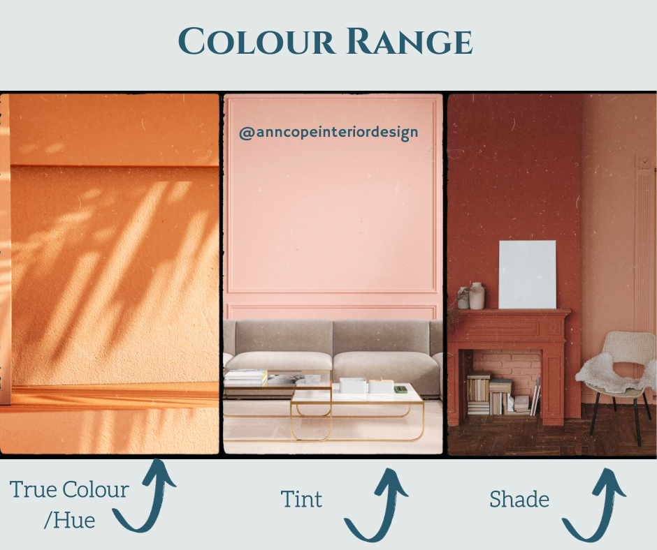
For those like me who are not entirely sold on the classic peach, exploring shades and tints can make all the difference. Blush pink, coral, and terracotta are all variations that offer a more subdued take on this vibrant hue. Incorporating these tones into decor or accessories allows for a gradual acceptance of peach into your aesthetic, creating a more personalized and appealing environment.
Conclusion:
In the journey through the world of Pantone’s colour of the year, I’ve come to realize that there’s more to peach than initially meets the eye. While I may not be an immediate convert, exploring the vast spectrum of shades and tints, coupled with the right lighting, can make a significant difference. The emotional and psychological benefits of peach, combined with its versatility, make it a colour worth considering for anyone looking to infuse warmth and tranquillity into their living spaces. So, whether you’re a peach enthusiast or a sceptic like me, there’s no denying the impact this colour can have on our homes and, perhaps, our hearts.


