Light up our life
Bearwish, Horndon-On-The-Hill
Lounge, Dining, Hall, Stairs and Conservatory Makeover
Inspirational Visit – followed by full design and project management
Darren & Christine loved the area they lived in, when a larger house came on the market just round the corner they decided this could be the forever home for them.
This new house was not overlooked, had larger spaces and amazing views. The internal decor of was dark and dated. Walls of reds, purples and large red poppies took over the space. The entrance hall and staircase was very dark and sucked the light out of the room with a wooden slatted false ceiling finished in a dark varnish.
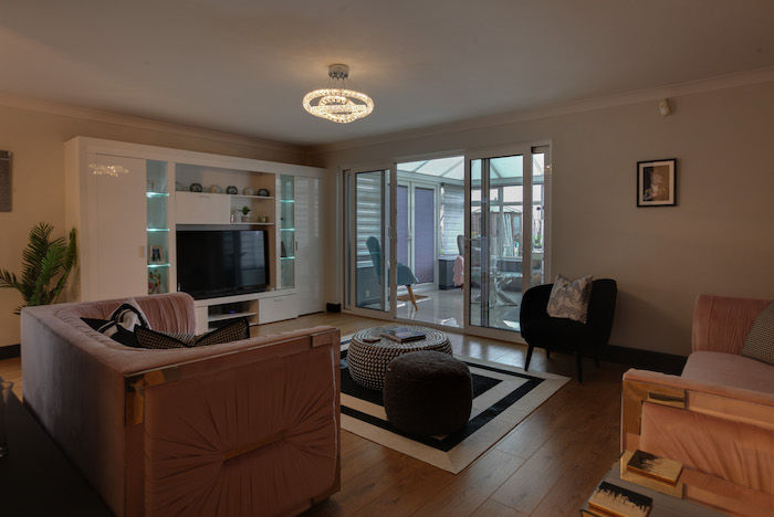
They contacted me to find ways to make more of the natural light and bring the spaces together.
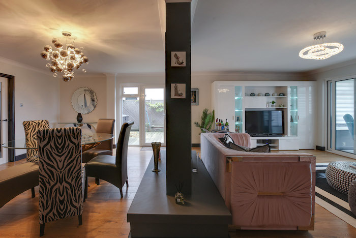
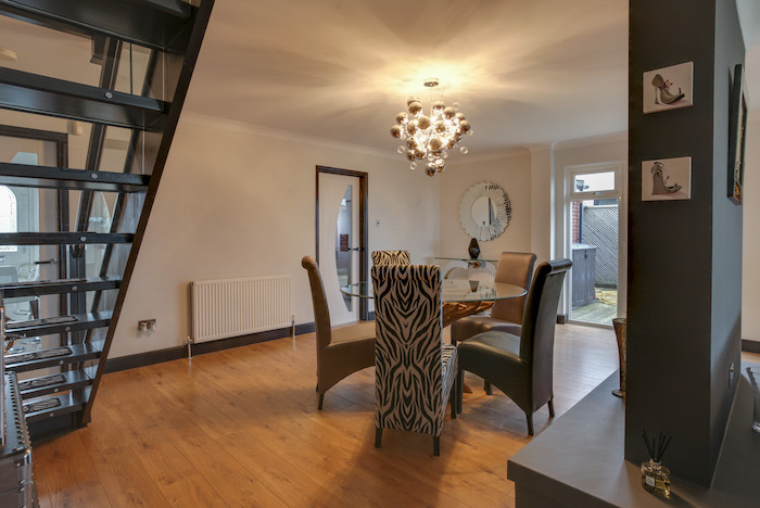
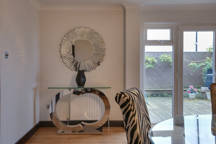
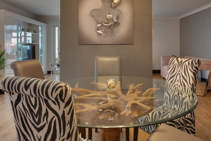
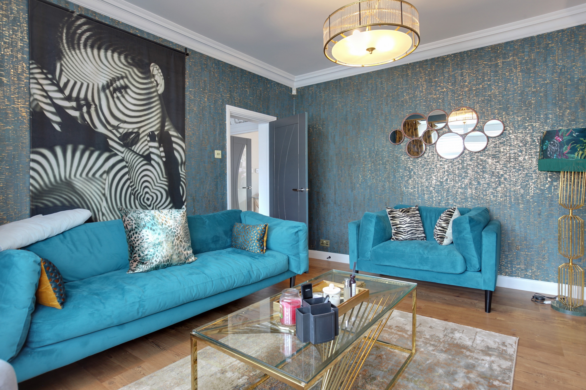
Christine & Darren have a love of animals (especially zebras!) and the colour pink in soft tones, incorporating these into the scheme was a must. My brief was to concentrate on the lounge, dining room, hall, stairs, landing, and conservatory.
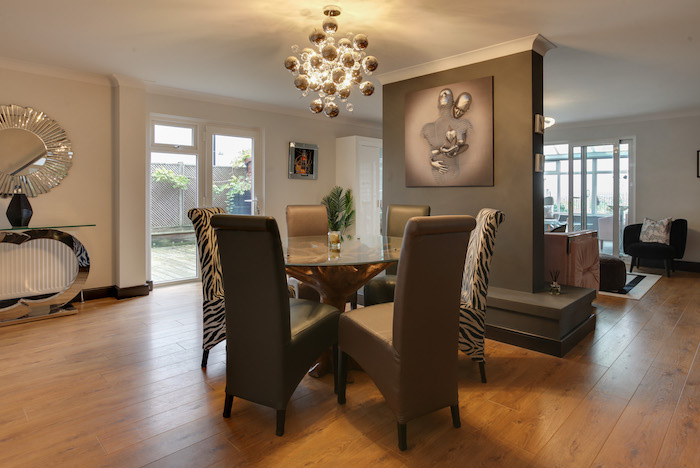
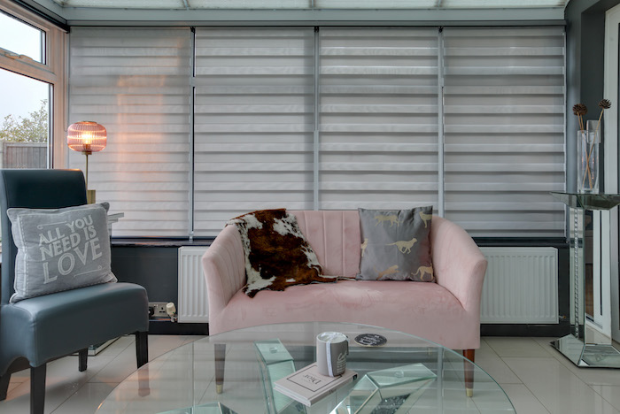

Christine was quite nervous to commit to some of my ideas whereas Darren was the opposite. However, my processes helped guide her through the decisions and visualise the finish, enabling her to have full confidence in me attaining a home with everything she had dreamed of and more.
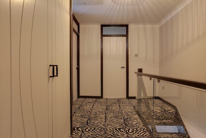
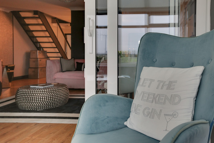
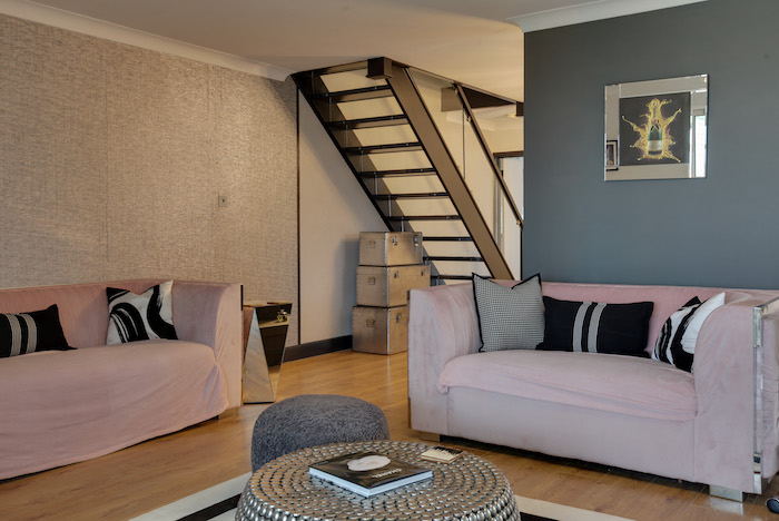
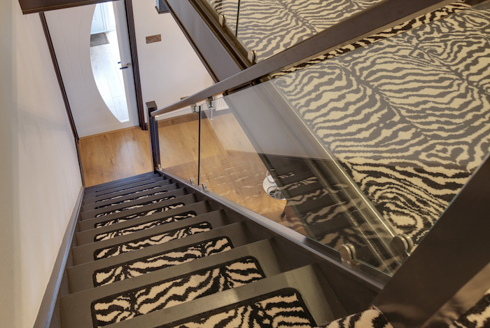
The first thing you saw when you came through the front door was a dark mahogany staircase. The staircase also sits in open plan living/dining room. Initially, they thought their only option would be to replace the staircase with a more contemporary lighter coloured one. To enable to keep costs down and get more from their budget I proposed that we alter the current staircase by opening the treads and having glass risers, replacing the dark spindles. This instantly made the whole area lighter and feel bigger, it gave sight lines into the dining area and lounge, whilst adding the contemporary feel they were after.
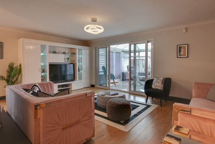
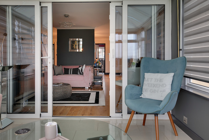
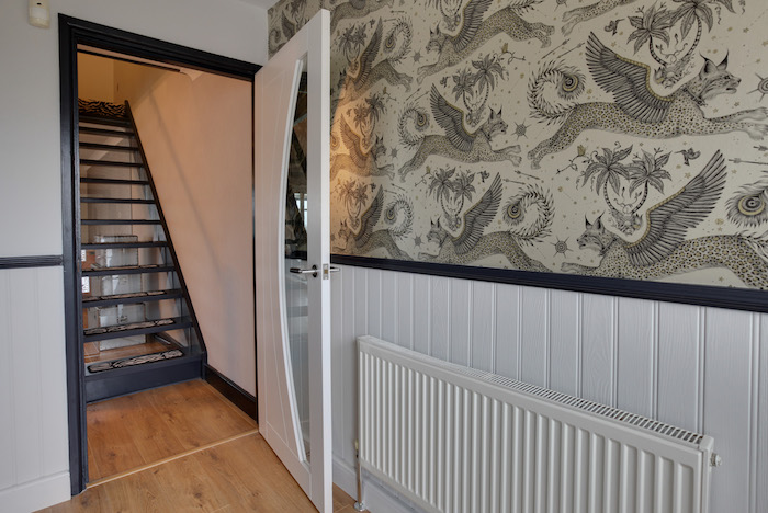
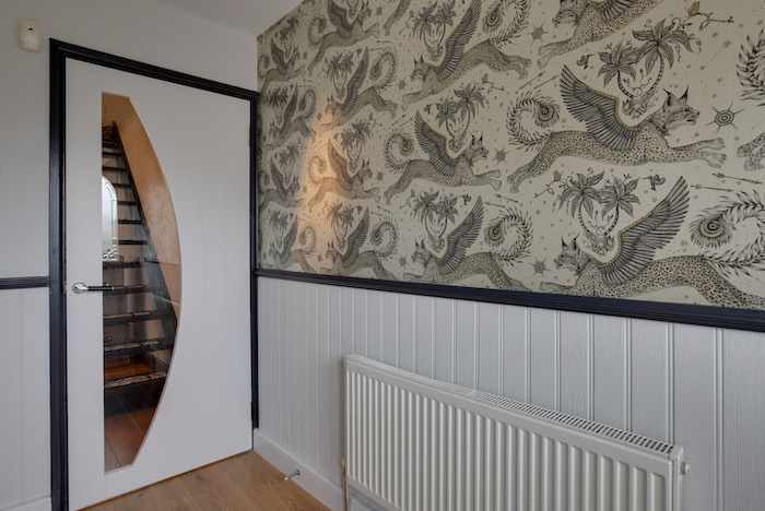
By changing the doors throughout to a more contemporary style with some glass-panelled allowed more natural light to fill the area. The hall was painted in a neutral colour and a feature wall was created using Emma J Shipley Lynx design wallpaper in the colour way gilver which had a reflective sheen – this combined helped bounce more light around the spaces.
Overall, this created an immediate “Wow” when coming in through the front door.
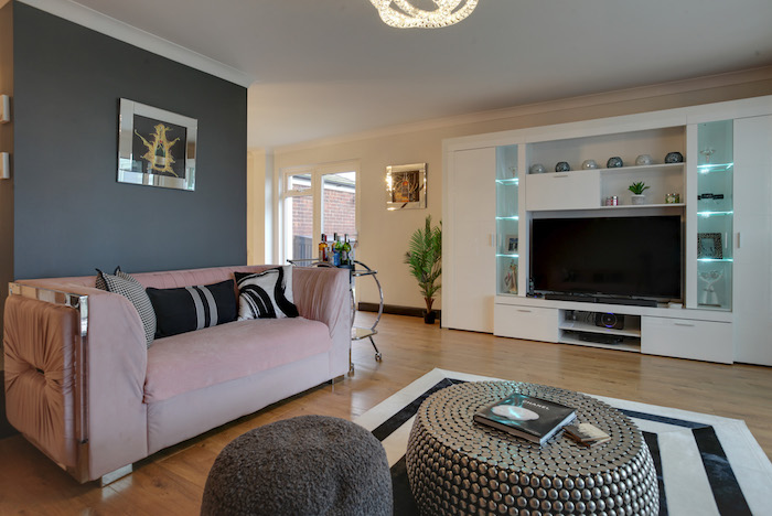
Between the dining area and lounge, there was “Big elephant” in the room, not an actual elephant! A large chimney breast imposed in the middle of the two rooms. The budget didn’t enable us to remove this and it certainly couldn’t be hidden – so we made it a feature to be proud of, pleasing to the eye from both areas. Painting it a darker colour and adding some statement art to draw the eyes. This worked perfectly!
